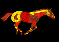
Texture
This exercise required drawing an object or animal and dividing it into sections. Each section was colored in with wax crayon. Different patterns were then scratched into the sections. India ink was painted over the entire paper with the wax acting as a resist.
Contrast
This project used contrasting pieces of construction paper. Using any letter of the alphabet, cut it out and paste it to a full sheet of paper. Taking the pieces left over from the letter they are pasted to another full sheet of paper in the best design possible. Mine just happened to make a bear, but most students came up with abstract designs.
Single Point Perspective Collage
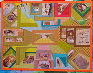
This project taught single point perspective with the use of value included. To make my collage, I used personal photo images and papers I created with my computer.
Morphing
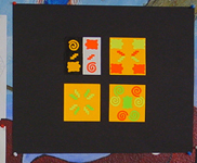
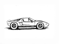
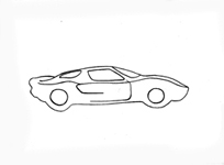
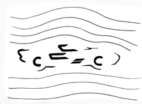
This was a three part process to go from a detailed drawing to one that was simplified down to its basic essence.
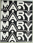
Repetition
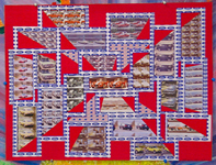
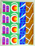
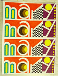
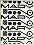
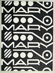
The instructions for this assignment were to take your first name and make a design for each letter. Those names with more than four letters didn't line up with the same letters in each for the four columns. They made for very different looks. At first I thought I was at a disadvantage having only four letters, but in the end I think I was lucky. Only one design was required, but I like to do more trying to improve as I go. The first image on the left uses Prismacolor pencils while the rest use Sharpie pens.

