Digital Imaging - Texture Exercise

Texture and Pattern

Pattern, in general, is comprised of a repeating design. Printed fabric and wallpaper are good examples of this. It usually deals with a flat surface or plane. Pattern is visual.

Texture, on the other hand, is tactile, meaning you can feel it with your fingers. The illusion of dimension on a flat plane can also be termed as texture. This is usually accomplished with contrast.

A texture can contain a pattern. A good example of this is diamond plate. You can feel the angular raised areas above the metal plane. When photographed, drawn, or painted you can still see the texture, along with the pattern. You get the sense of touch without actually feeling the piece.


Click to Enlarge

SPEED, NOISE, VIBRATION, ACCELERATION...

1

STEP 1

Background
: TEXTR_06 (1A)
Resized to 480x640, rotated 90*

Curves (1B)

Photo Filter (1C)
Filter: Deep Yellow
Density: 85%
Preserve Luminosity

1A
1A
1B
1B
1C
1C

STEP 2

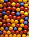
Layer 2: GUMBL-01 (2A)

Used vector work path by using elliptical tool to put holes in center of gumballs.  After using liquefy command added crosshatch brush stroke filter. (2B)

2A
2A
2B
2B
STEP 3

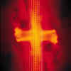
Layer 3: DataFunk_red (3A)
Resized to 480x640 then rotated 90*
Blending Options (3B)
General Blending

Blend Mode: Luminosity
Opacity: 84%
Advanced Blending
Fill Opacity:
87%
Channels: G
Rest: Default

Effects: Drop Shadow and Inner Shadow

3A
3A
3B
3B

STEP 4

FONT: Trekker-2 (4 )
SETTINGS: Regular / 10 pt / Sharp / Color: TOYO PCF 0202

DROP SHADOW
Structure
Blend Mode: Multiply
Opacity: 75%
Angle: -42 Use Global Light
Distance: 5px
Spread: 0px
Size: 5px
Quality
Default

BEVEL AND EMBOSS
Structure
style: stroke emboss
technique: chisel hard
depth: 930%
direction: up
size: 226px
soften: 14px
Shading
Angle: -42
Use Global Light
Altitude: 16
Anti-aliased
Highlight Mode: Screen
Opacity: 92%
Shadow Mode: Multiply
Opacity: 100%

4
4

SOME LIKE IT HOT ! !

I threw this together quickly and with several interruptions.  So, I didn't make good notes on what I did.  Here is the best I can remember:

STEP 1

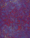
Background: Neon_Crystals

STEP 2

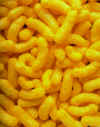
Layer 2: CHEEZ_01

Image resized to 480x640 then rotated 90*

Used vector work path. By using the custom shape tool, set to grass shape, I scattered and overlapped different sized shapes to form a pattern that brought through the background layer.

STEP 3

Layer 3: DataFunk_red 
Image resized to 480x640
then rotated 90*
Blending Options
Gradient Overlay
Gradient Blend Mode: Normal
Opacity: 80%
Gradient: Foreground to background

STEP 4

FONT: Tempus Sans ITC
SETTINGS: Regular / 36 pt /         Strong / Color: TOYO PCF 0202
EFFECTS
DROP SHADOW
BEVEL AND EMBOSS
OUTER GLOW

This is my kind of project.  I really enjoy "playing around" with the different effects we can use.  It's great that we can create an abstract work of art from every day objects.  Aren't computers great!

Back to Top